
Veri Görselleştirme Kataloğu Türkçeye Çevrildi
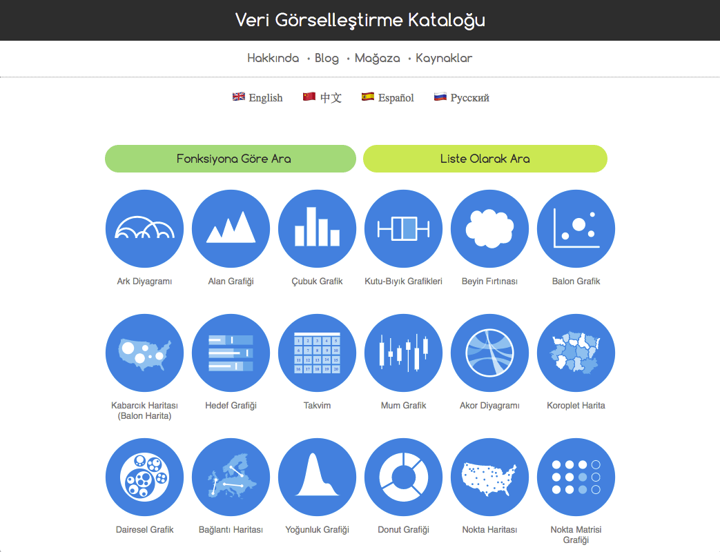
Veri Görselleştirme Kataloğu Türkçeye çevrildi. Katalog veri gazetecilerinin sıklıkla yararlandığı önemli bir araç. Türkçesi datavizcatalogue.com/
60 görselleştirmenin çevrildiği katalogda, ‘Fonksiyona Göre Ara‘, ‘Liste Olarak Gör‘ bölümleri yer aldığı gibi, ana sayfada yer alan her bir grafik tıklandığında tanım, kullanım fonksiyonu, örnekler, benzer grafikler, görselleştirme sağlayan araçlar, anatomi de yer alıyor.
Çeviri Ekibi Hakkında
Katalog Pınar Dağ editörlüğünde Işıl Yarımoğlu, Sadettin Demirel, Ayşegül Engür, Kübra Sultan Yüzüncüyıl, Onur Hüseyin Teksan, Faruk Aydıner, Örge Tümer, Sabri Eğe tarafından yapıldı.
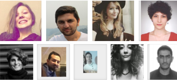
Çeviri ekibinde 5’i Kadir Has Üniversitesi Yeni Medya Bölümü’nden çeşitli yıllarda Veri Gazeteciliği (Lisans/Yüksek Lisans) eğimi almış öğrenciler, 2’si Dağ Medya‘da Veri Gazeteciliği Stajyerliği yapmış yeni medya öğrencileri ile birlikte bir araştırma görevlisi yer alıyor ve çeviri sürecinin editörlüğü ise Kadir Has Üniversitesi Öğretim Görevlisi Pınar Dağ tarafından yürütüldü.
Interview with Pınar Dağ & Turkish Site Launch
İngilizce için: http://datavizcatalogue.com/blog/turkish-site-launch/
January 12, 2018
The Turkish version of the website has now gone live:
The Turkish language has 71 million native speakers worldwide and is the most widely spoken of the Turkic languages. Originally, the Turkish language used the Ottoman Turkish alphabet which was Perso-Arabic based, but thanks to Atatürk in 1928, the language switched to a Latin alphabet.
You’re probably curious as to why the site has been translated in this language.
Well, back in late-2016 I was contacted by a lady from Turkey who asked me if I ever considered translating the website into another language. It was something I had never thought of before, but it actually makes sense considering that not everyone speaks English. I agreed and over the past year or so, Pinar Dağ and a number of other people had been working hard to translate the Data Visualisation Catalogue into Turkish.
Now that the site is finally done, I spoke to Pinar to get her motivations to get some insight into the data visualisation and data journalism scene in Turkey:
DVC: Would you like to introduce yourself?
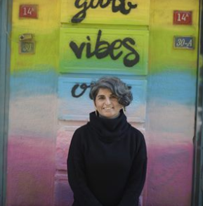
PD: My name is Pınar Dağ, I live in İstanbul, Turkey. I am a lecturer of data journalism working at Kadir Has University in the New Media department since 2014. I am a co-founder of a number of data journalist news portals: Dağ Medya, Data Journalism Platform Turkey and the Open Data and Data Journalism Association in Turkey.
I teach the entire process of data journalism: how to collect data, how to filter + analyze data, how to clean messy data, and how to visualize data to tell a story.
Outside of Academia, I also give workshops and training about open data, data journalism and data visualization. Since 2012 to today I have contributed to and organized more than 50 activities, events, talks, panels about data journalism, both around Turkey and abroad.
DVC: What got you into data visualisation and data journalism?
PD: I was studying journalism at LSJ when I lived in London. At that time Wikileaks was on the agenda (the Iraq War and Afghan War documents leaks between 2004 and the end of 2009). I was translating from English into Turkish for the Turkish media on this story. There were also documents related to Turkey’s foreign policy in the leaked files.
However, at the time, I realized my technical skills and my ability to work with data was inadequate. So this situation motivated me.
I gradually learned how to work more effectively with data. I read books, searched for samples, participated in online training courses, and received certifications in data journalism. Then I thought that this area can be a valuable method for the Turkish media as well. So, I started to create my own content, write a book on data journalism, produce data journalism projects, organized workshops on data journalism, open data, and data visualisation. I also provided the first-ever Turkish massive open online course in Turkey about data literacy and Open Data training with seven people (including a data visualization training module).
The most important motivation that directed me to this field was actually my desire to develop myself.
DVC: What motivated you provide a translation of The Data Visualisation Catalogue?
PD: You expressed this on your About page:
I felt it would also be beneficial to both designers and also anyone in a field that requires the use of data visualisation. Although there have been a few attempts in the past to catalogue some of the established data visualisation methods, there is no website that is really comprehensive, detailed or helps you decide the right method for your needs. Each visualisation method was added bit-by-bit, as I individually researched each method, to find the best way to explain how it works and what it is best suited for.’
In fact, I wrote to you to translate the catalogue into Turkish with a similar concern and thought.
English literacy is not very good in Turkey. Because of this, foreign sources on data journalism and data visualization training are not always beneficial. Data journalism training is a particularly challenging process, as most of the tools you use to visualize your data are in English.
Of course, I teach these tools in my classes or at my workshops in Turkish. However, I felt it was important to address this issue for the future. Yes, I produce content on a regular basis, but it would be difficult if I tried to create a data visualization catalogue myself. As a matter of fact, even though I had suggested some institutions, I could not get a result. The main motivation was to have a site with visualization methods in Turkish, as it would provide more convenience during my training courses.
You know, I started translating the Data Visualisation Catalogue myself first. Then I thought it would be more effective to work on it as a team. In the summer of 2017, I proposed to both my students who were trained in data journalism and to those who were interested in the field. With those who agreed to help, we had some nice teamwork together. So, I would like to say that I am very happy with the result.
Also thank you for your help, of course. You gave a lot of effort. It is amazing work.
To translate the entire website, Pinar worked togther with: Onur Hüseyin Teksan, Faruk Aydıner, Örge Tümer, Sabri Eğe, Işıl Yarımoğlu, Sadettin Demirel, Ayşegül Engür, Kübra Sultan Yüzüncüyıl. Special thanks for all your help.
DVC: How commonplace are infographics and data visualisation in the Turkish media and publications?
PD: Data visualization is not new to the Turkish media. When we go back 100 years in the archives/records, it is also possible to see handmade data visualizations from 1930 or earlier in Turkish newspapers.
However, if I do need to evaluate it with today’s technology, it is not as effective as the Western or Asian media. On the other hand, the interactive work is still new and I can say that it is developing in Turkey.
The most common implementations of data visualizations are timetables, interactive maps, line, bar, pie charts and sometimes we can see on investigative journalism files. Some newsrooms such as Evrensel, Birgün, Cumhuriyet, Bianet, Dağ Medya and more use infographics and data visualisation. Widely used open source dataviz tools, such as Google fusion tables, data wrapper, CartoDB, Google maps, and ArcGIS are also being used.
There are journalists who want to acquire and implement these skills, but newsrooms need to devote more time to develop them more effectively. However, in the last 2-3 years, I can say that the effort to visualize and use data in Turkey has improved a bit more than in previous periods. This is especially the case through online news sites and large media outlets that I follow. Yet, as you can imagine, journalists still do not have enough time or skill to use these impressive technologies. Apart from newsrooms, there are platforms that work and prepare infographics.
In summary, I can say that Istanbul is the city with the most media organizations. Especially the most effort is in this area is in Istanbul. We see more workshops, training and events activities are in Istanbul. Istanbul is followed by Ankara. In these two cities, the intellectual accumulation and effort are the most intense.